> For the complete documentation index, see [llms.txt](https://avaloniachina.gitbook.io/avalonia/llms.txt). Markdown versions of documentation pages are available by appending `.md` to page URLs; this page is available as [Markdown](https://avaloniachina.gitbook.io/avalonia/docs/controls/relativepanel.md).
# RelativePanel
The `RelativePanel` control is a `Panel` which lets you layout elements by specifying where they go in relation to other elements and in relation to the panel.
By default, an element is positioned in the upper left corner of the panel.
Attached properties are used to control the layout of elements. This table shows those properties.
| Panel alignment | Sibling alignment | Sibling position |
| ------------------------------ | ------------------------- | ---------------- |
| AlignTopWithPanel | AlignTopWith | Above |
| AlignBottomWithPanel | AlignBottomWith | Below |
| AlignLeftWithPanel | AlignLeftWith | LeftOf |
| AlignRightWithPanel | AlignRightWith | RightOf |
| AlignHorizontalCenterWithPanel | AlignHorizontalCenterWith | |
| AlignVerticalCenterWithPanel | AlignVerticalCenterWith | |
This XAML shows how to arrange elements in a RelativePanel.
```markup
```
The result looks like this.
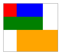
Here are a few things to note about the sizing of the rectangles:
* The red rectangle is given an explicit size of 44x44. It's placed in the upper left corner of the panel, which is the default position.
* The green rectangle is given an explicit height of 44. Its left side is aligned with the red rectangle, and its right side is aligned with the blue rectangle, which determines its width.
* The orange rectangle isn't given an explicit size. Its left side is aligned with the blue rectangle. Its right and bottom edges are aligned with the edge of the panel. Its size is determined by these alignments and it will resize as the panel resizes.
### Reference
[RelativePanel](http://reference.avaloniaui.net/api/Avalonia.Controls/StackPanel/)
### Source code
[RelativePanel.cs](https://github.com/AvaloniaUI/Avalonia/blob/master/src/Avalonia.Controls/RelativePanel.cs)
---
# Agent Instructions
This documentation is published with GitBook. GitBook is the documentation platform designed so that both humans and AI agents can read, navigate, and reason over technical content effectively. Learn more at gitbook.com.
## Querying This Documentation
If you need additional information that is not directly available in this page, you can query the documentation dynamically by asking a question.
Perform an HTTP GET request on the current page URL with the `ask` query parameter:
```
GET https://avaloniachina.gitbook.io/avalonia/docs/controls/relativepanel.md?ask=
```
The question should be specific, self-contained, and written in natural language.
The response will contain a direct answer to the question and relevant excerpts and sources from the documentation.
Use this mechanism when the answer is not explicitly present in the current page, you need clarification or additional context, or you want to retrieve related documentation sections.