# DatePicker
The `DatePicker` control allows the user to pick a date value.
## Examples
{% tabs %}
{% tab title="XAML" %}
```markup
```
{% endtab %}
{% tab title="CS" %}
```csharp
DatePicker birthDatePicker = new DatePicker();
```
{% endtab %}
{% endtabs %}
## Remarks
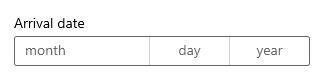
Use a `DatePicker` to let a user enter a date value. The user picks the date using [ComboBox](https://avaloniachina.gitbook.io/avalonia/docs/controls/combobox) selection for month, day, and year values. You can customize the `DatePicker` in various ways to suit your app.
.png?alt=media)
### Formatting the date picker
By default, the date picker shows the day, month, and year. If your scenario for the date picker doesn't require all the fields, you can hide the ones you don't need. To hide a field, set its corresponding \_field\_Visible property to `false`. For more info, see the `DayVisible`, `MonthVisible`, and `YearVisible` properties.
The string content of each `ComboBox` in the `DatePicker` is created by a `DateTimeFormatter`. You can use a string that is either a *format template* or a *format pattern* to specify the format. For more info, see the `DayFormat`, `MonthFormat`, and `YearFormat` properties.
### Date values
The date picker control has both `Date` / `DateChanged` and `SelectedDate` / `SelectedDateChanged` APIs. The difference between these is that `Date` is not nullable, while `SelectedDate` is nullable.
The value of `SelectedDate` is used to populate the date picker and is `null` by default. If `SelectedDate` is `null`, the `Date` property is set to 12/31/1600; otherwise, the `Date` value is synchronized with the `SelectedDate` value. When `SelectedDate` is `null`, the picker is 'unset' and shows the field names instead of a date.
To use the date value in your app, you typically use a data binding to the `SelectedDate` property, or handle the `SelectedDateChanged` event.
You can set the `MinYear` and `MaxYear` properties to restrict the date values in the picker. By default, `MinYear` is set to 100 years prior to the current date and `MaxYear` is set to 100 years past the current date.
If you set only `MinYear` or `MaxYear`, you need to ensure that a valid date range is created by the date you set and the default value of the other date; otherwise, no date will be available to select in the picker. For example, setting only `yearDatePicker.MaxYear = new DateTimeOffset(new DateTime(900, 1, 1));` creates an invalid date range with the default value of `MinYear`.
**Initializing a date value**
The date properties can't be set as a XAML attribute string, because the Windows Runtime XAML parser doesn't have a conversion logic for converting strings to dates as [DateTime](https://docs.microsoft.com/en-us/uwp/api/windows.foundation.datetime) / [DateTimeOffset](https://docs.microsoft.com/en-us/dotnet/api/system.datetimeoffset?view=dotnet-uwp-10.0\&preserve-view=true) objects.
This example demonstrates setting the
```csharp
myDatePicker.SelectedDate = new DateTimeOffset(new DateTime(1950, 1, 1));
```
## Reference
[DatePicker](http://reference.avaloniaui.net/api/Avalonia.Controls/TextBox/)
## Source code
[DatePicker.cs](https://github.com/AvaloniaUI/Avalonia/blob/master/src/Avalonia.Controls/DateTimePickers/DatePicker.cs)